SegmentedButton
import { SegmentedButton } from "material.slint";export component Example inherits Window { width: 300px; height: 100px; background: transparent; SegmentedButton { model: [ { icon: @image-url("icons/list.svg"), text: "List" }, { icon: @image-url("icons/grid.svg"), text: "Grid" } ]; current-item: 0; }}slint
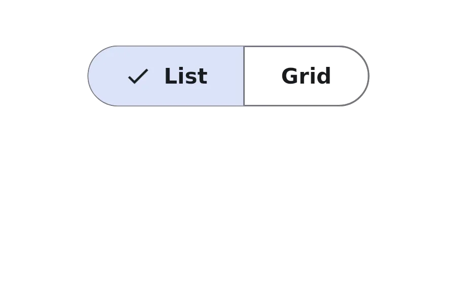
A SegmentedButton displays a group of related options as a single control, where only one option can be selected at a time.
Properties
Section titled “Properties”current-item
Section titled “current-item”int (in-out) default: 0
The index of the currently selected item.
[struct SegmentedItem] default: a struct with all default values
SegmentedItem
This structure represents an item in a segmented button control.
icon(image): The icon to display for the item.text(string): The text label for the item.
An array of segmented items, each containing an icon and text.
Functions
Section titled “Functions”select(index: int)
Section titled “select(index: int)”Selects the item at the specified index.
© 2025 SixtyFPS GmbH