NavigationRail
import { NavigationRail } from "material.slint";export component Example inherits Window { width: 400px; height: 300px; background: transparent; NavigationRail { width: 80px; height: parent.height; items: [ { icon: @image-url("icons/home.svg"), text: "Home" }, { icon: @image-url("icons/search.svg"), text: "Search" } ]; }}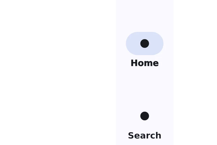
A NavigationRail is a vertical navigation component that displays navigation items with optional menu button and floating action button.
Properties
Section titled “Properties”alignment
Section titled “alignment”enum LayoutAlignment default: the first enum value
LayoutAlignment
Enum representing the alignment property of a layout
stretch: Use the minimum size of all elements in a layout, distribute remaining space based on*-stretchamong all elements.center: Use the preferred size for all elements, distribute remaining space evenly before the first and after the last element.start: Use the preferred size for all elements, put remaining space after the last element.end: Use the preferred size for all elements, put remaining space before the first element.space-between: Use the preferred size for all elements, distribute remaining space evenly between elements.space-around: Use the preferred size for all elements, distribute remaining space evenly before the first element, after the last element and between elements.
The alignment of the navigation items within the rail.
current-item
Section titled “current-item”int (in-out) default: 0
The index of the currently selected navigation item.
fab-icon
Section titled “fab-icon”image default: the empty image
The icon for the floating action button.
has-menu
Section titled “has-menu”bool default: false
Whether to show a menu button at the top of the rail.
[struct NavigationItem] default: a struct with all default values
NavigationItem
This structure represents a NavigationItem with an icon, text, badge, and empty badge.
icon(image): The icon to display in the item.icon-selected(image): The icon to display in the item when selected.text(string): The text to display in the item.empty-badge(bool): Whether the badge is empty.badge(string): The badge to display in the item.
An array of navigation items to display in the rail.
Callbacks
Section titled “Callbacks”menu-clicked()
Section titled “menu-clicked()”Invoked when the menu button is clicked.
fab-clicked()
Section titled “fab-clicked()”Invoked when the floating action button is clicked.
© 2025 SixtyFPS GmbH