NavigationBar
import { NavigationBar } from "material.slint";export component Example inherits Window { width: 400px; height: 200px; background: transparent; NavigationBar { width: parent.width; height: 80px; items: [ { icon: @image-url("icons/home.svg"), text: "Home" }, { icon: @image-url("icons/search.svg"), text: "Search" }, { icon: @image-url("icons/settings.svg"), text: "Settings" } ]; }}slint
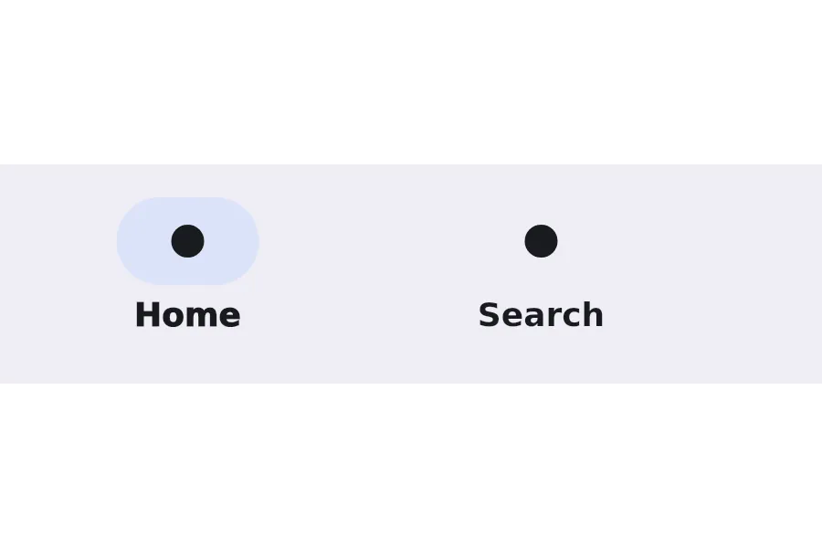
A NavigationBar is a bottom navigation component that displays a row of navigation items with icons and labels. It’s commonly used for primary navigation in mobile applications.
Properties
Section titled “Properties”current-item
Section titled “current-item”int (in-out) default: 0
The index of the currently selected navigation item.
NavigationBar { current-item: 0;}slint
[struct NavigationItem] default: a struct with all default values
NavigationItem
This structure represents a NavigationItem with an icon, text, badge, and empty badge.
icon(image): The icon to display in the item.icon-selected(image): The icon to display in the item when selected.text(string): The text to display in the item.empty-badge(bool): Whether the badge is empty.badge(string): The badge to display in the item.
An array of navigation items to display in the bar.
Functions
Section titled “Functions”select(index: int)
Section titled “select(index: int)”Selects the navigation item at the specified index.
© 2025 SixtyFPS GmbH